Composition
 We learn about composition from the rules of graphic design, which are based in part on what seems to be pleasing to the human eye and brain (or, sometimes, on what the people writing about graphic design have decided is inherently pleasing.) But lately, I have been thinking about composition in a new way. And I have particularly been noticing when famous paintings have composition I’d have thought of a failed. For example, Monet’s Corner of the Garden at Montgeron, in which rose bushes block some of the view. I realize that is part of the point with impressionism, to catch the moment in light but presumably also in space, but the rose bushes blocking one’s entry into the space of the garden -or even one’s view of the lawn and the pond- prevents me from enjoying the peek into the summer garden.

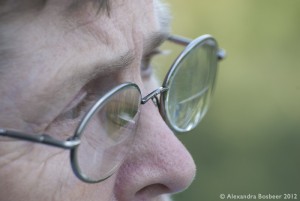
We learn about composition in portraits, too, with a nicely framed face and not too much unused space. Sometimes the space is essential, such as in this compelling portrait by Eberhard Riedel of a woman in Eastern Congo called ‘Thinking back’. But mostly we see as a nice portrait a focus on the nice face, with shoulders or some torso, and maybe showing the hands holding something characteristic.
 It’s not always so, though, even in Dutch Golden Age paintings. Look at the large space over the woman’s head in Woman warming her hands over a brazier by Cesar Boëtius van Everdingen. I giggled to myself as I imagined that, if she were to feel warm up enough to stand up straight, she would fill the frame in a more classical composition. The very centre of the portrait of Maria van Strijp by Johannes Verspronk is her huge, valuable pendant; but when you pair her portrait with her husband’s, the space between their torsos and faces seems filled with companionable silence.